Uber Movement traffic data finally makes it out of beta

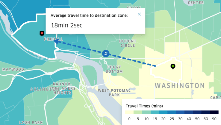
Uber Movement, announced back in January, finally went live today. The service gives anyone access to some of Uber’s internal demand and usage data. The hope is that cities and urban planners can use the data to support projects that would help reduce congestion and generally help people get from point A to point B faster.
For now the data is only available for a handful of cities, including Bogotá, Boston, Manila, Sydney and Washington, D.C. From within the available web app you can explore average travel times between any two neighborhoods. The map data comes with accompanying charts that display helpful facts, like travel times broken down by time of day and day of the week.
The most valuable asset here though is the time series data. Uber is making this data available for download in CSV files under Creative Commons, Attribution Non-Commercial licenses so that it can be easily added into models.
Uber mentioned previously that it hopes to eventually release an API to help with access. This hasn’t happened yet, but Uber encourages researchers to email the team if they have a creative use case requiring additional granularity.
I’d imagine that it would make sense for Uber to perhaps release data for a specific locality within a city for a specialized project, but I can’t see the company giving out enough to allow for anyone to build anything overly cool (competitive). All the data is anonymized to accommodate privacy concerns.
Any infrastructure improvements that cities can make with Uber data will improve outcomes for Uber drivers and customers. The faster drivers can get passengers to their destination, the faster they can jump to the next fare.
