Facebook and Instagram get redesigns for readability
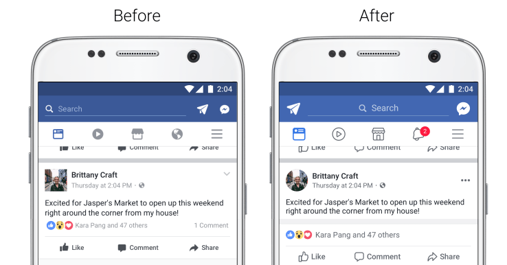
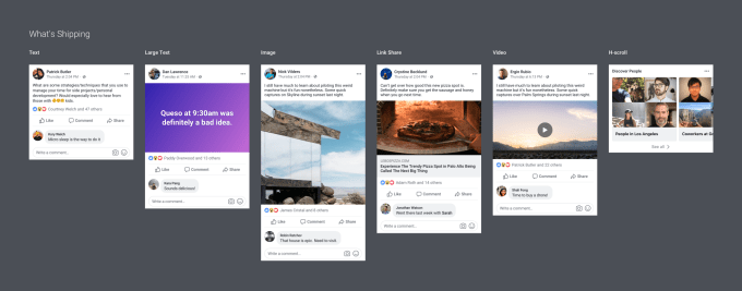
Taking inspiration from line drawings, Reddit and Messenger, Facebook is overhauling the design of the News Feed to make it more legible, clickable and commentable. Specifically, Facebook now makes it much clearer where threads start and end in comments. Meanwhile, Instagram today got a little redesign itself with comment reels now being threaded so you can have sub-conversations in public.
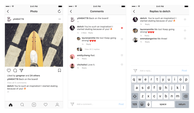
Facebook periodically updates its design, typically stripping out unnecessary “chrome,” or user interface framing, to create a sleeker, more readable look. There’s more and more white space on Facebook, which could be intended to reduce eye fatigue during long browsing sessions and let your friends’ content pop off the screen more vividly.
Facebook’s design team writes “we did not want to just ‘fiddle at the edges’, but rather make something that billions of people use every day less frustrating.”
Both the Facebook and Instagram changes will roll out to all iOS and Android users over the next few weeks.
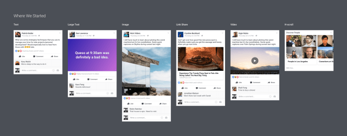
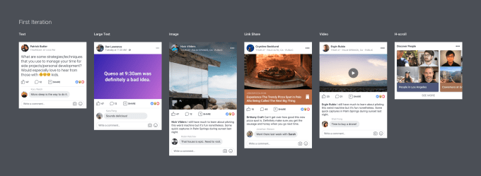
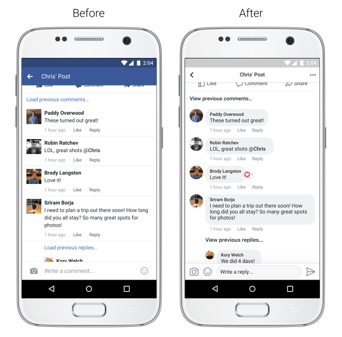
Facebook comments
Facebook is adopting the Messenger bubble style for comments. This will make threading more obvious, but also encourage the rapid-fire conversations people typically have in private messages. Facebook has been trying to make comments feel more alive recently with fast-moving conversations becoming their own chat windows.
Navigation and like buttons
Facebook has made its navigation and feedback buttons bigger and easier to recognize with a new unfilled line drawing style. The News Feed, Video, Marketplace, Like, Comment and Share buttons now all feature this look. Meanwhile, Facebook is swapping the classic globe notifications icon for a more standard alerts bell. These could all be less distracting to the eye so you focus on Facebook’s content, not its chrome.

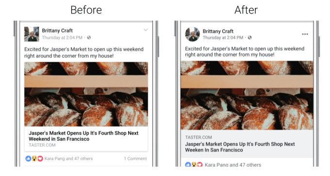
Other redesigns for legibility include higher contrast text that’s easier to see and circular profile photos that take up less space and feel more human. Link previews are now a little bigger, too, which could get more people clicking and sending referral traffic to other sites. However, Facebook says today’s changes shouldn’t impact the reach or traffic of Pages. The URL domain is now more prominent, appearing above the link’s headline, which could reduce the likelihood that users click fake/hoax sites that mimic popular news publisher URLs.
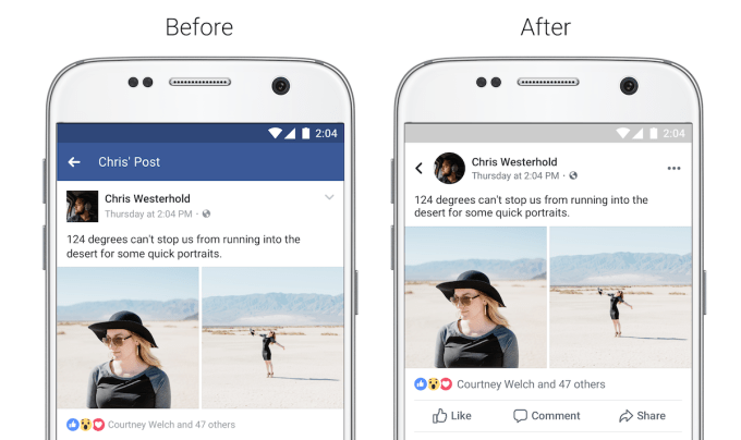
Knowing where you are
Facebook wants to make sure you don’t get lost several layers deep beyond the feed. Now you’ll see a more obvious header with a bigger black back button when you dive into a post from the News Feed. Facebook also says you’ll be able to “See where a link will take you before clicking on it,” though it already had link previews, blurbs and URLs, so we’ve asked for clarification here.
Design ethics
As Facebook and Instagram restyle themselves to boost usage, a question arises about design ethics. Is building a better mousetrap beneficial to society? Facebook and Instagram certainly allow communities and friend groups to grow their bonds, but when does fruitful exchange and sentimental entertainment give way to mindless scrolling?
As former Google design ethicist Tristan Harris discusses in his TED talk, over-optimization for engagement on social networks has created apps that are addictive to the point of being destructive.
Over the years I’ve repeatedly asked Facebook’s top executives like CPO Chris Cox and VP of News Feed Adam Mosseri about whether the company is doing research into how to prevent or minimize internet addiction that can stem from Facebook’s ad-driven business model, and I’ve never gotten a direct answer that indicates they think it’s a priority.
They do care about their users’ experience, with Cox telling me “We’re getting to a size where it’s worth really taking a careful look at what are all the things that we can do to make social media the most positive force for good possible.” But you can always have too much of a good thing.
The execs tell me Facebook wants to make sure all your time spent on its apps is “meaningful”. Yet at some point when people are sitting in the dark alone refreshing the feed over and over, it could be worth surfacing Internet addiction and mental health tips, or encouraging them to connect directly with a friend via messaging.
Perhaps one day our apps will be redesigned not just to soak up more attention, but to warn us when we’re neglecting everything else.