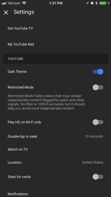
A dark mode for YouTube’s mobile app is spotted in the wild

Last spring, YouTube rolled out a massive update to its desktop site that included a redesign, faster underlying framework, and the addition of a dark mode. Now, that dark theme may be making its way to the YouTube mobile app, as well.
The change was recently spotted by MacRumors (by way of Reddit), and is already appearing for some users of the most recent version (13.0.1) of the YouTube mobile app.
It’s not clear at this point which YouTube users have already received the dark mode option, though a number of commenters on the original Reddit posting chimed in to say that they’ve just received the new setting, too, along with the original poster.
If available, you’d find the option to turn on dark mode – called “Dark Theme” – in the YouTube app’s Settings screen, just above the Restricted Mode setting.
One Redditor claimed they were able to force the Dark Theme to appear by force-closing the app, then relaunching it. However, it could have been a coincidence that the setting appeared after they took that step – it didn’t work in our tests, we should note.
Another said they didn’t receive the option in Settings, but were rather prompted to try the dark mode via a pop up message that appeared.

Dark Theme screenshot, via Reddit user OustedHoChiMinh
While a relatively minor tweak, a dark mode has been among the top requests from YouTube users for a variety of reasons, beyond it just looking cool. When staring at a screen for long periods of time, dark mode can be easier on the eyes, for starters, and it allows users to better focus on the content itself, not the various controls and other navigational elements. Some tests have also shown dark modes to save on battery life. That’s useful, given that over half of YouTube’s views come from mobile, and users are spending more than an hour per day watching videos on mobile devices.
At the time YouTube originally launched the Dark Theme on desktop, the company wouldn’t confirm if it would port the theme to other devices, including mobile. Instead, YouTube said that it would track usage of the Dark Theme to see if the feature was widely adopted before determining if it made sense to roll out further.
Even if the Dark Theme on mobile is just a test at this time, it does at least indicate that YouTube saw enough traction on desktop to warrant trialing the option on mobile.
If YouTube were to launch a dark mode on mobile, it wouldn’t be the only app do so. Twitter also has a dark mode available, as do other apps like podcast player Overcast, Reddit client Apollo, and Twitter client Twitterific.
YouTube hasn’t yet responded to requests for comment on the appearance of Dark Theme, but we’ll update if we hear back.
Featured Image: nevodka/iStock Editorial