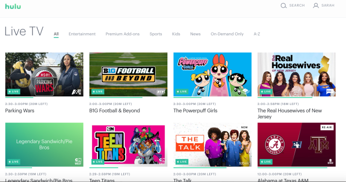
Hulu responds to user complaints with a grid guide for Live TV

User feedback about Hulu’s new interface has not been entirely positive. In fact, a complaint about the new user interface is the most upvoted item on Hulu’s customer feedback forums, and is then followed by dozens of similar complaints which all say the same thing: it’s too hard to find shows, the interface is too difficult to navigate, the layout is confusing, and so on.
Today, Hulu is responding – at least, in part – to some of these complaints with the launch of a grid-like guide for its Live TV service.
To be fair, one of the challenges for Hulu is that it’s trying to merge a Live TV service – similar to Sling TV or PlayStation Vue – with an on-demand service, similar to Netflix. That means when you subscribe to the $40 Hulu with Live TV service, you can watch shows from Hulu’s on-demand library and its originals, and you can flip through live TV channels.
But this poses a number of problems, too. For example, when I’m tracking a show that’s still on the air but has also moved into syndication – like, say “Grey’s Anatomy” (hey don’t judge me) – Hulu’s “My Stuff” (its revamped Watchlist) all summer suggested I watch the “next” episode due to air. But in advance of the fall premiere, this would be a re-run from several years ago. Not helpful.
The new guide doesn’t solve this problem, but it at least makes it easier to browse Live TV separately from the on-demand content.
“One of our key learnings from our Live TV viewers is that our live content feels, at times, hidden or harder to get to than you would like. So we set out to make some changes,” explains Ben Smith, Head of Experience at Hulu, in a blog post.
He notes how Hulu has already acted on some user feedback when it implemented things like new episode badging and the ability to see more options when browsing. And he hints that other changes are in the works, as well, also due to user complaints feedback.
“…we’ve learned a ton over the last six months too, especially by listening very closely to our viewers and community on social, in forums and through the feedback you’ve given through our Viewer Experience Advocates. And we agree there are a number of enhancements that we can make to improve the viewing experience even more,” Smith admits.
The Live TV guide is only one of these changes, and is initially available on the web before arriving on other platforms.
The new guide is accessed during live playback from a button in the bottom left corner or by hovering your cursor to the left of the browser window. You can then scroll up and down to find something else to watch, and change channels with a click. The experience is much like a traditional cable TV guide, but tucked away in a smaller side pane instead of a full-screen view.
The main interface on the web, however, still relies on larger image thumbnails instead of an expanded grid-style guide, but it at least separates live TV content from on-demand. It also lets you filter live TV by category (News, Sports, Entertainment, Kids.)

It’s not likely that this change alone will be enough to stem user complaints.
People’s real concerns are less about the difficulties of surfacing live TV content on Hulu, and more about the overall design and interface – an interface people say has too many layers, is poorly personalized, and is confusing to navigate.
Hulu says it will test the guide on the web before rolling it out further, and will also work on improving recommendations.