iOS 14 widgets: Everything you need to know
With iOS 14, Apple has reinvigorated the iPhone home screen with new tools to make it more useful and better organized. A large part of that is the new treatment of widgets — those snippets of information that previously lived on the Today page, to the left of the home screen.
Widgets were introduced in iOS 10, though they’ve always been hamstrung by their lack of modularity and Apple’s counter-intuitive philosophy of sequestering them off to their own screen, where you might totally forget they exist.
Thankfully, iOS 14’s new approach to widgets looks to be an improvement in every way. Coupled with Apple’s other new home screen feature — the App Library — the new widgets interface helps iOS 14 close its gap to Android with respect to personalization. Oh, and they also look gorgeous.
Here’s a deeper dive into iOS 14’s widgets overhaul, and how it’ll make your iPhone’s home screen better than ever before.

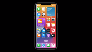
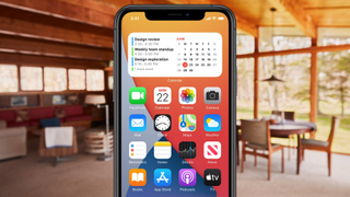
The most obvious change to widgets in iOS 14 is that they can now live among apps, and on the same screens as apps, rather than being limited to their own page. This offers flexibility in structuring your home screens, and allows you to put information that’s most important front and center, in a glanceable and easily accessible space.
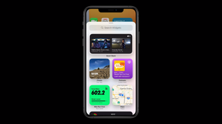
Widgets are also really easy to drag and drop into an existing home screen. Simply long press any app to get into Jiggle mode (yes, that’s seriously what Apple calls the editable state of the iOS home screen) and tap the plus icon at the top right of the display. From there you’ll be able to select any widget you like and drop it in, and all your other app icons will float out of the way to make room for the new addition.
Apps and widgets still behave the same way they always have in iOS, in that they fill available space sequentially and there can be no gaps between them. In other words, the home screen still doesn’t act totally like Android’s, because you can’t leave empty spaces, or have an entire empty page that just shows your wallpaper, for example.

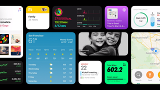
Widgets have also been massively upgraded in terms of their appearance. In iOS 13 today, widgets are rather boring looking and generally devoid of color. They’re also sparse in terms of information — the Weather widget, for example, consumes lots of space but doesn’t use it to any great effect, simply showing the current conditions outdoors and the day’s highs and lows, without a more granular hourly or weekly forecast.
iOS 14’s widgets are beautiful by comparison. They’re much more colorful and visually interesting — at least Apple’s first-party ones — and come in a variety of sizes to fit into a multitude of layouts. They can sit side-by-side, consuming a 2×2 square in a grid, or dominate an entire page if you like, stretching across four rows and columns.
If there’s one frustration Apple should address before iOS 14 releases in full, it seems that in the first developer beta, there’s no way to resize widgets once they’ve already been placed. In other words, you can’t change from the 4×2 Calendar widget to the 2×2 one if it’s already present on your home screen. Unlike Android, there are no handles to resize widgets, so you have to delete your existing widget and then add another to replace it with a differently-sized version. Fortunately, this would appear to be easy enough to fix, if Apple is so inclined.

While Apple’s approach to widgets in iOS 14 isn’t particularly revolutionary — just revolutionary for iOS — Smart Stacks are a truly clever idea. A Smart Stack is, quite literally, a stack of widgets that you can swipe through for access to other apps within that same window. As you swipe, the stack will change focus, going from Apple News, to your calendar, to the daily forecast, for example.
That’s a nifty quirk on its own, but what makes Smart Stacks actually intelligent is that they dynamically change focus throughout the day, depending on contextual cues. For example, when you wake up, your Smart Stack may default to Weather. But around the time you begin work, it’ll shift to your appointments for the day. And when you get home, it’ll turn into a little photo slideshow. You can still swipe through your stack to access information from other apps, but the emphasis on relevancy is what makes this class of widgets especially powerful.
Furthermore, you can edit Smart Stacks so that only the apps you choose are in the rotation, or you can drag and drop one widget into another similarly-sized one to create a stack from nothing. Simply long press a stack, and you’ll be able to add and remove apps, adjust settings for specific apps within the stack, or turn off Smart Rotate, which disables the intelligent, context-based switching aspect.

Although Apple didn’t mention them during its iOS 14 reveal, third-party developers will indeed have access to the new widgets experience.In fact, if you watched closely during the WWDC 2020 keynote, you may have noticed widgets from Nike and Words With Friends hiding among the rest.
Currently, no third-party widgets exist — we have iOS 14 installed on one of our iPhones, and at the present, you can only choose between widgets from built-in Apple software. Hopefully, by the time iOS 14 finally launches in the fall, a swath of popular apps will have new widgets available as well that can truly take advantage of iOS 14’s capabilities.
It’ll be interesting to see how those third-party widgets integrate with Smart Stacks in particular. Apple didn’t chat about what other developers will be able to do with widgets, so at this stage, it’s unclear if Smart Stacks’ context-based shuffling will extend to include software from third parties, or if Apple wants to restrict it only to apps baked within the system.
Anyone who’s been using iPhones for a long time knows how important iOS 14’s widgets will be. The home screen interface on Apple’s handsets always felt antiquated, like it fell short of expectations. But Cupertino says it’s learned a lot from developing complications for Apple Watch, and that it’s gleaned insights in how to display a wealth of information within a relatively constrained space.
Even at this early stage, iOS 14’s widgets look great, are intuitive to add and use, and have a richness to them that’s been missing from Android’s widgets, as Google has languished in updating the look and feel of widgets in its own mobile OS over the years.
All that said, there are still months to go before Apple delivers iOS 14 to the masses, so widgets may gain even more powerful abilities and new use cases in the coming months — not to mention, they’ll be continually improved by feedback from beta users. So stay tuned.


