Apple revamps web design for App Store

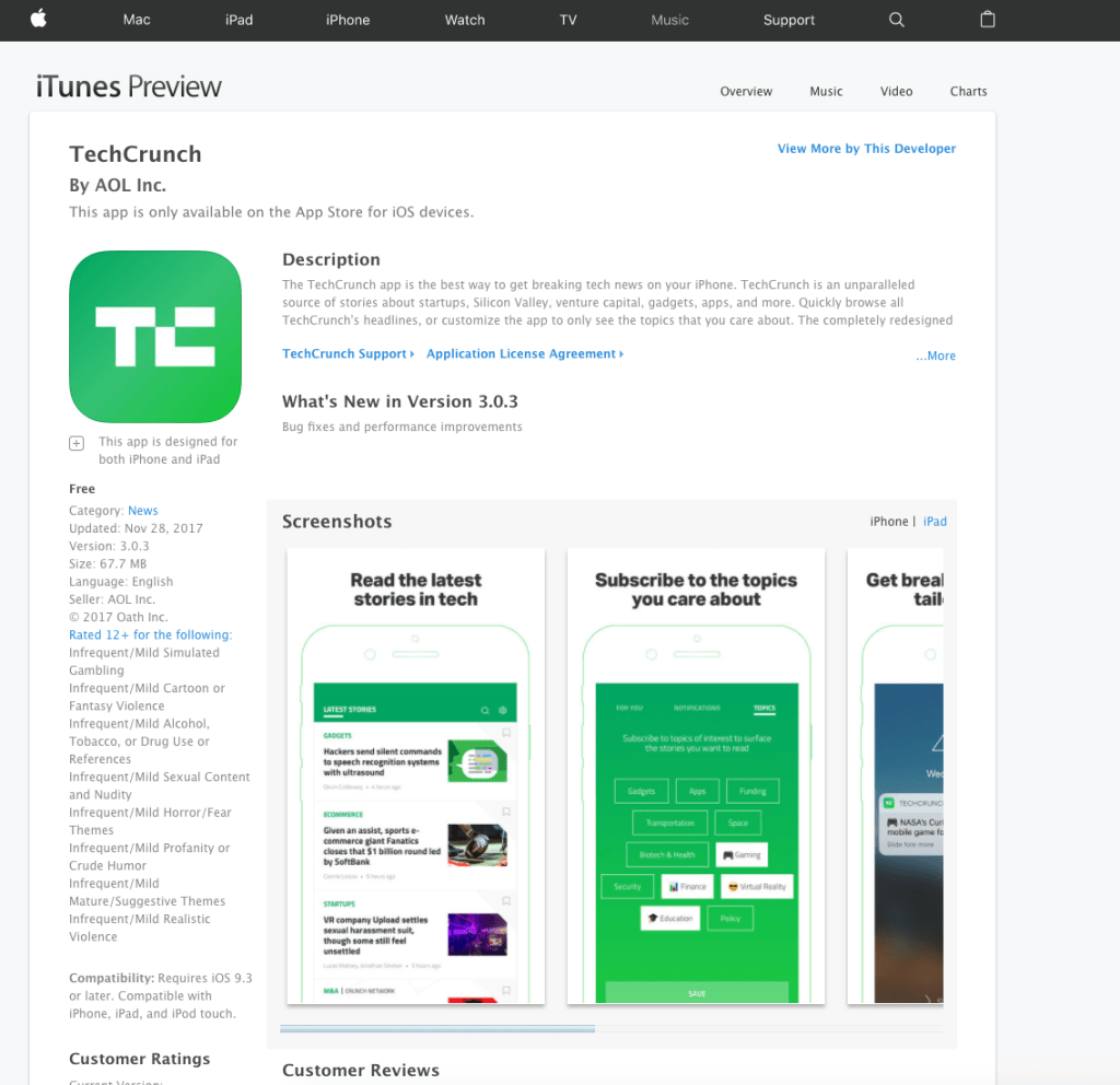
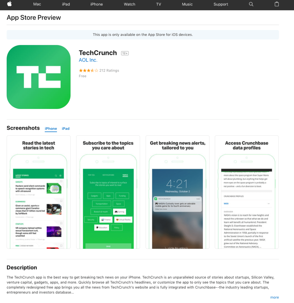
Apple has updated the look of its web-based App Store, 9to5Mac first reported. It definitely has the feel of the iOS 11 App Store, which Apple completely redesigned and launched last September. But, unlike iOS 11, there’s no focus on app discovery.
The functionality is about the same as before, but what it comes down to is the clean design that feels simpler — perhaps due to the increased amount of white space. There’s also a bit more of an emphasis on reviews.
If the app is optimized for iPhone X, Apple now shows iPhone X screenshots rather than screenshots from older phone models. Oh, and now Apple reminds you that its apps are only available on the App Store for iOS devices.
Let’s check it out.
Here’s before:

And here’s after:
