Curious about Tesla’s unique Model 3 in-car UI? Check out this mock-up

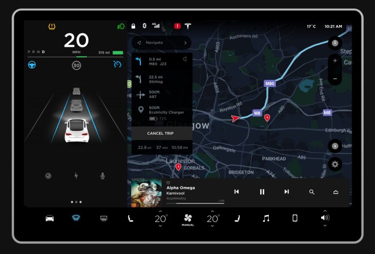
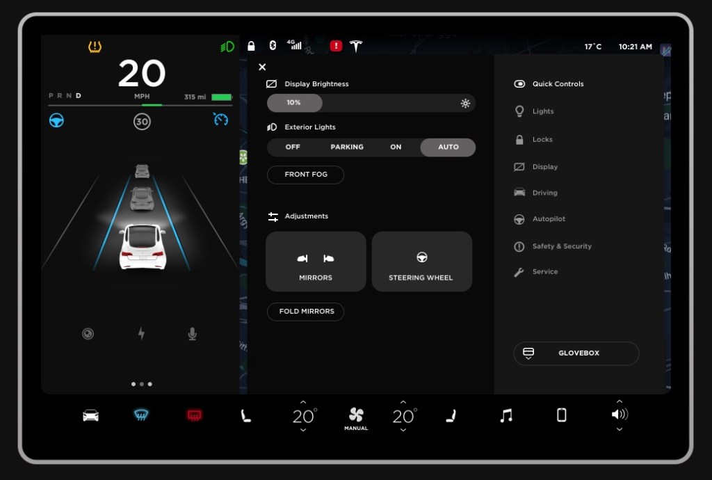
Tesla’s Model 3 is unique in a lot of ways, but one that stood out among the early reviews and photos was the dashboard, which is essentially unbroken by instrumentation save for that single, large 15-inch touchscreen that sits in the middle next to the steering wheel. We have photos of the dash and its various screens, but a Tesla fan put together an interactive simulation of the display user interface (via Electrek)that looks very accurate, based on what I experienced in the car itself.
The mockup actually reacts to your clicks and taps, though it’s not fully fleshed out – only so much is available to the public right now to recreate the interface. It looks to have everything I saw in the right place, however – including amazing aspects like the touch-based directional climate control UI, which works really well in practice to direct the flow of heat and AC through the basically invisible vents integrated into the dash.
The navigation map, music player and speedometer/virtual representation of your vehicle and its position relative to traffic also look true to form. Basically, if you wanted to get a sense of what it was like to drive the Model 3 from a cockpit controls standpoint ahead of actually being able to check one out (and it sounds like it’ll be a while before it even makes it to showrooms), this is your best bet.
